Every year we see different design trends. Some trends stick – some don’t.
What I enjoy more every year is that designers (including myself!) continue to get more strategic and always seem to find creative ways to promote and market content better!
Most of the trends I adapt myself or have already been putting into practice for years. Some of them, I’m not super crazy about. I’m sure you have a few of those yourself too. One common one I’ve seen is the use of fully-justified text on websites. I’m not a huge fan of this design style. 😂 Have you adapted this trend or have you seen it frequently?
The 3 most common trends this year I’ve noticed are everywhere! So let me dive right into what those are with a few examples! 💪🏼
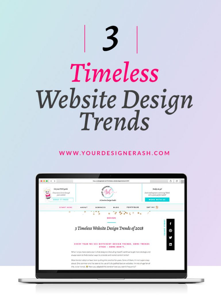

#1: The scroll
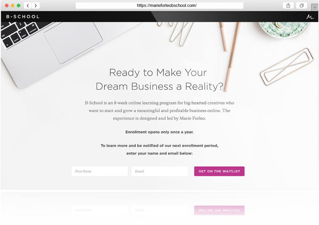
 Long pages and infinite scrolling is how users figure out if your service is right for them.
There is a myth that “users don’t scroll” and it’s a huge misconception. Your audience wants to know all the details so they can decide whether your service is right or not for them. So, a long website page is how to accomplish this.
Recent reports have suggested that infinite scrolling is an accepted navigation practice. Users are also more likely to scroll through longer content when the design is broken up into digestible sections.
By adopting a long page scroll, it eliminates multiple pages being added to your website and will decrease the “wild goose chase” for your user.
Help Your Users Navigate with Scroll Cues
You may notice many visual cues such as an arrow instructing you to “click here” to return to the top of a webpage or other content cues such “Back to the top” or “Take me to the top”. These buttons are particularly beneficial for sales pages and information pages where content is quite long.
This trend isn’t new, but I haven’t seen it used as prominently in previous years as I have now. Designers are adopting this UX style because it’s easier for website users to quickly get back to the top of the page without having to scroll. Let’s be honest, we’re lazy!
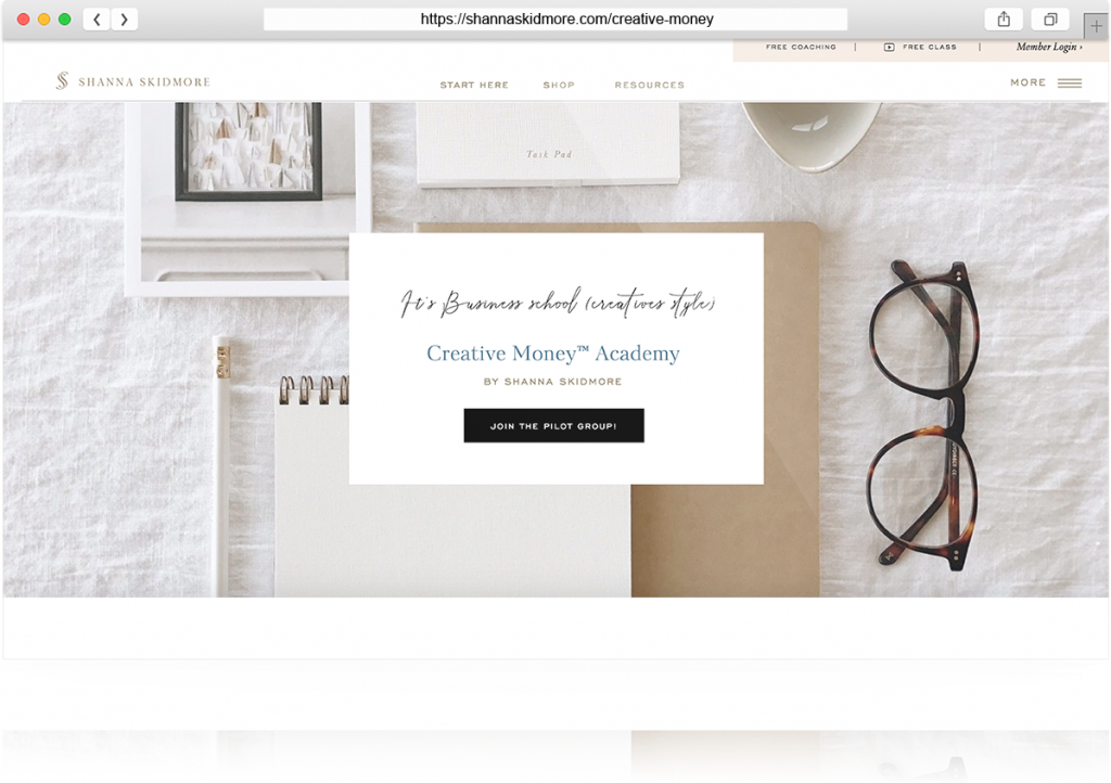
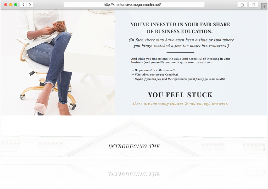
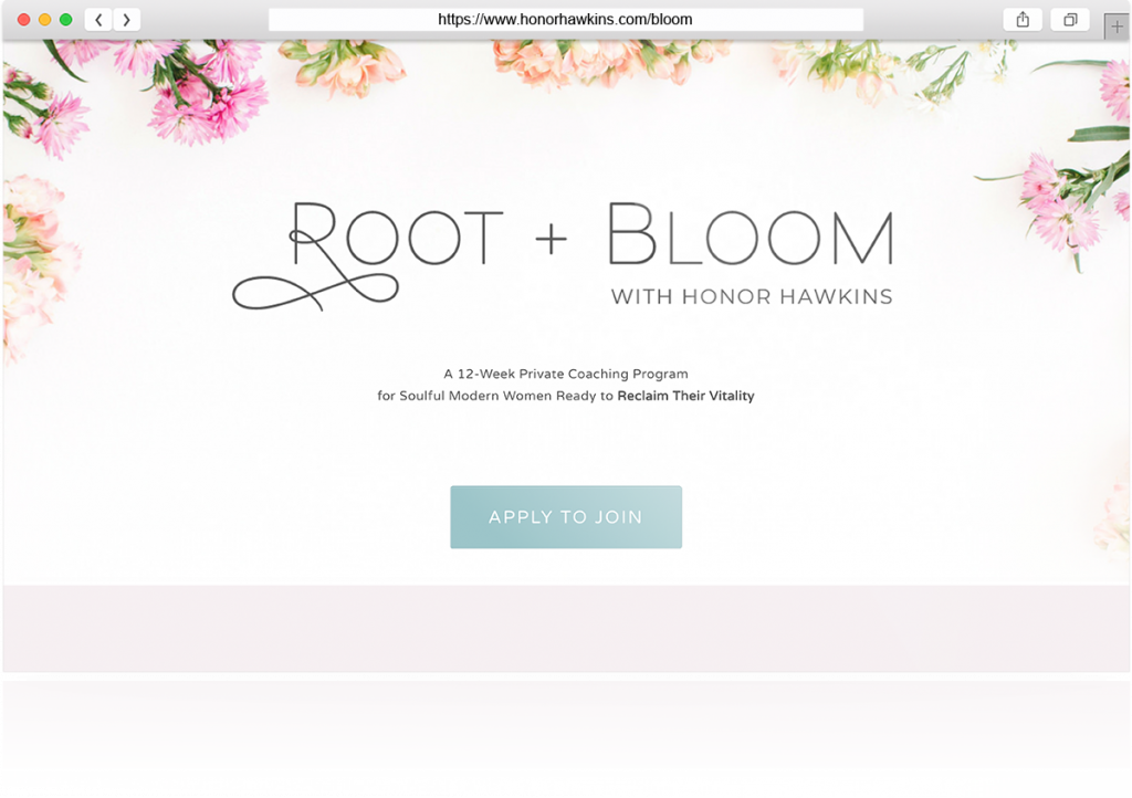
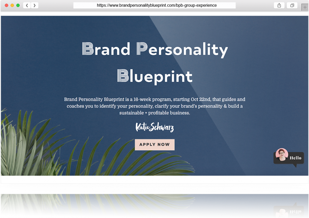
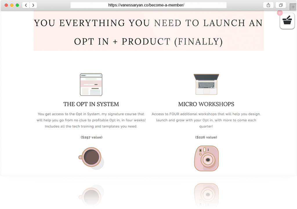
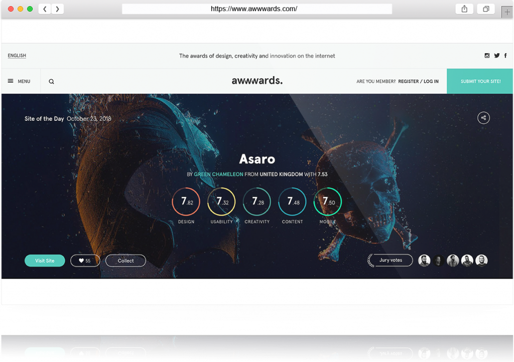
Here are a few sales pages and websites using long scrolling that works:
 #2. Split Screens & Vertical Content
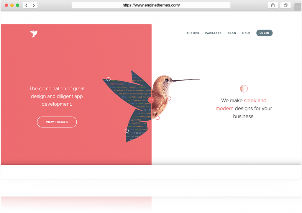
The split-screen aesthetic trend continues to grow and the benefits are huge for users.
A split screen gives your audience a choice. Presenting options are what people want! Who doesn’t like options? Being able to see two content choices helps the user feel like they are in the driver’s seat and it allows them to select an option that best suits their needs. So, by creating dual importance in offerings will effectively convert your users in either direction!
Another trend I’ve seen is the use of vertical content on websites. Having content slanted is visually interesting and intriguing to the user’s eye. It’s a playful way to attract attention to various content blocks.
Below, I’ve compiled a couple of split screen examples:
 #3. Desktop Hamburger Menu
 In case you aren’t familiar with this icon, it’s three lines stacked on top of each other to form the shape of a hamburger.
There’s been some debate about whether or not it’s the best use of real estate for Desktop users to have a mobile menu aka. the hamburger icon as the only form of site navigation. In other words, the whole desktop utilizes a mobile appearance rather than a full navigation.
Using the hamburger icon for desktop has its advantages and disadvantages. It’s clean, minimal and keeps your website uncluttered. However, it’s also hard to locate and doesn’t present your audience with all the option to navigate your site smoothly. I’ve seen this trend being used specifically in industries such as photography, architecture, advertising, and media websites. It’s a great concept for industries that are displaying minimal content and the focus of their content is heavier on visuals. I wouldn’t adopt this trend for websites that require more than a 5-page navigation or for any e-commerce websites. The hamburger menu will keep your content clean on the desktop, however, the site should be minimal and not complex to navigate from the beginning.
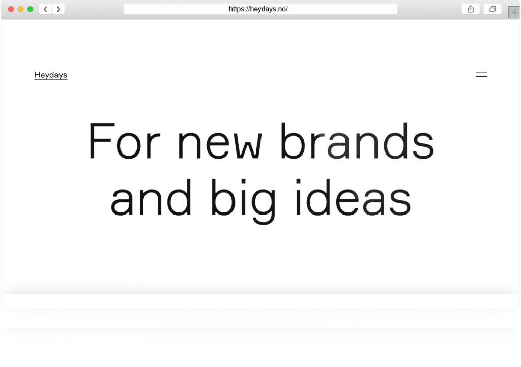
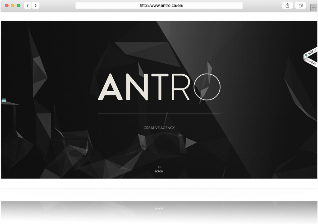
Here are some websites that utilize the hamburger icon on the desktop:
Final Thought

These trends are fun, engaging and timeless. They will continue to be used this year as well as in the coming years. If you’re considering these design techniques for your website, ask yourself a few questions:
- Does this trend align with your audience or will it confuse them?
- Does it enhance the overall user experience or does it take away from it?
- Will it bring clarity to the content or is it only visually appealing?
The most important piece on your website will be your content. Your content is what fuels your design, so keep this in mind when you’re thinking about adding in the shiny new things!
What other design trends have you seen this year? Which do you love? Which do you hate?
Psst...before you go! Get our FREE e-book:
how to attract, delight and close more clients
PLUS GET DESIGN TIPS, ADVICE & FREEBIES DELIVERED TO YOUR INBOX
DOWNLOAD THE EBOOK
Ashley Gadd
Written By:
Ashley Gadd is an award-winning business brand strategist, website designer, and educator who helps clients turn their ideas into captivating and strategic brands that convert. Blending her background in nonprofit marketing with her education in design, Ashley offers customer-centric brand experiences that connect the visual and strategic dots providing her clients the tools to build a sustainable and profitable business they’re proud of.
Brand Strategist - Website Designer - Educator
Leave a Reply Cancel reply
Anything is possible. Explore more.
CONTENT MARKETING
Case Studies
BUSINESS STRATEGY
WEBSITE
BRANDING
Sales Funnels
Let's be Friends!
Connecting the design and marketing dots to create a visual story that captures your shine and shares your message and mission in style.
Use this worksheet to bring more clarity to your business! Let this be your first step before you tackle your ideal customer profile and buyer persona.
FIND YOUR NICHE WORKSHEET!
DOWNLOAD THE WORKSHEET
Stick Around!
and bring much-needed clarity to your business.
JOIN IN THE CONVERSATION