Hey guys!
I’m always thinking about ways to help my clients improve their businesses through website design. Today, I’d like to share my latest journey down this never-ending rabbit hole with you.
Here’s the most recent conclusion I’ve come to:
If you build a website on the right platform, the possibilities for your business are endless.
Now, there are tons of website platforms out there. When it comes to those of you who provide coaching, training, and other wellness solutions, there are two platforms in particular that work really well:
So, does it matter which one you build your website with?
It certainly does!
I’ve built websites for clients using both of these platforms. And there are obvious reasons to pick one over the other depending on your business’s needs. Today, I’d like to shed some light on what you can expect from a website built with Showit vs. Squarespace.
Showit vs. Squarespace: Which Should You Use?
Before I dig into the nitty-gritty, let’s quickly look at the reasons why you might prefer Showit over Squarespace (or the other way around):
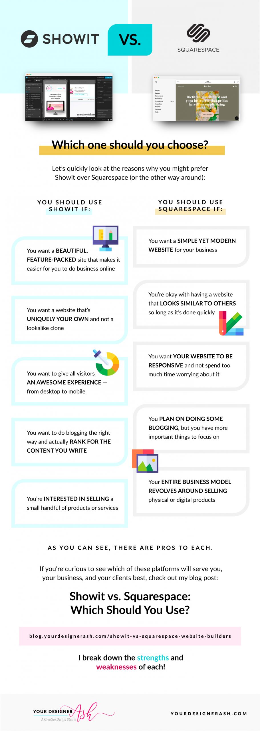
| You should use Showit if:
|
You should use Squarespace if:
|
|
|
|
|
|
|
|
|
|
|
As you can see, there are pros to each. If you’re curious to see which of these platforms will serve you, your business, and your clients best, keep reading as I break down the strengths and weaknesses of each:
Your website design
You want a website that reflects your business, your mission, and maybe even a little bit of your personal style.
Here’s how far Showit and Squarespace will allow you to go with your website’s design:
Squarespace website design
Squarespace websites tend to be very dependent on pre-designed templates. In fact, when you first sign up with Squarespace, it asks you to complete a short questionnaire so you can be matched with the right “starting points” (or templates):
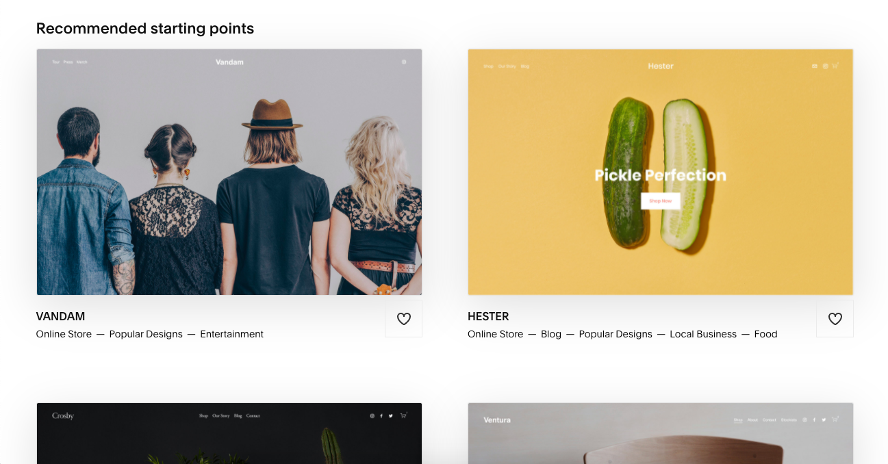
While it’s certainly convenient to have Squarespace automatically design a website for you, it does limit how creative or custom your website design can be.
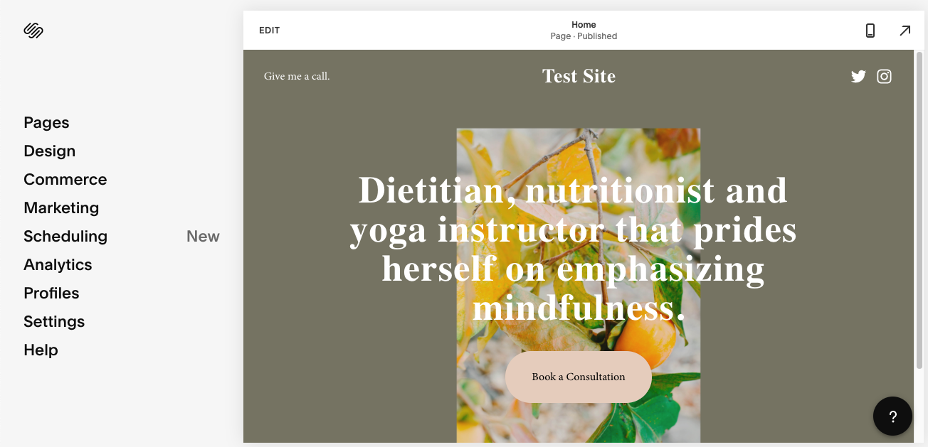
It’s not like you can’t edit the template you choose or even change templates altogether if you’re unhappy with the one you have. However, what you’re allowed to edit in a Squarespace template is very limited:
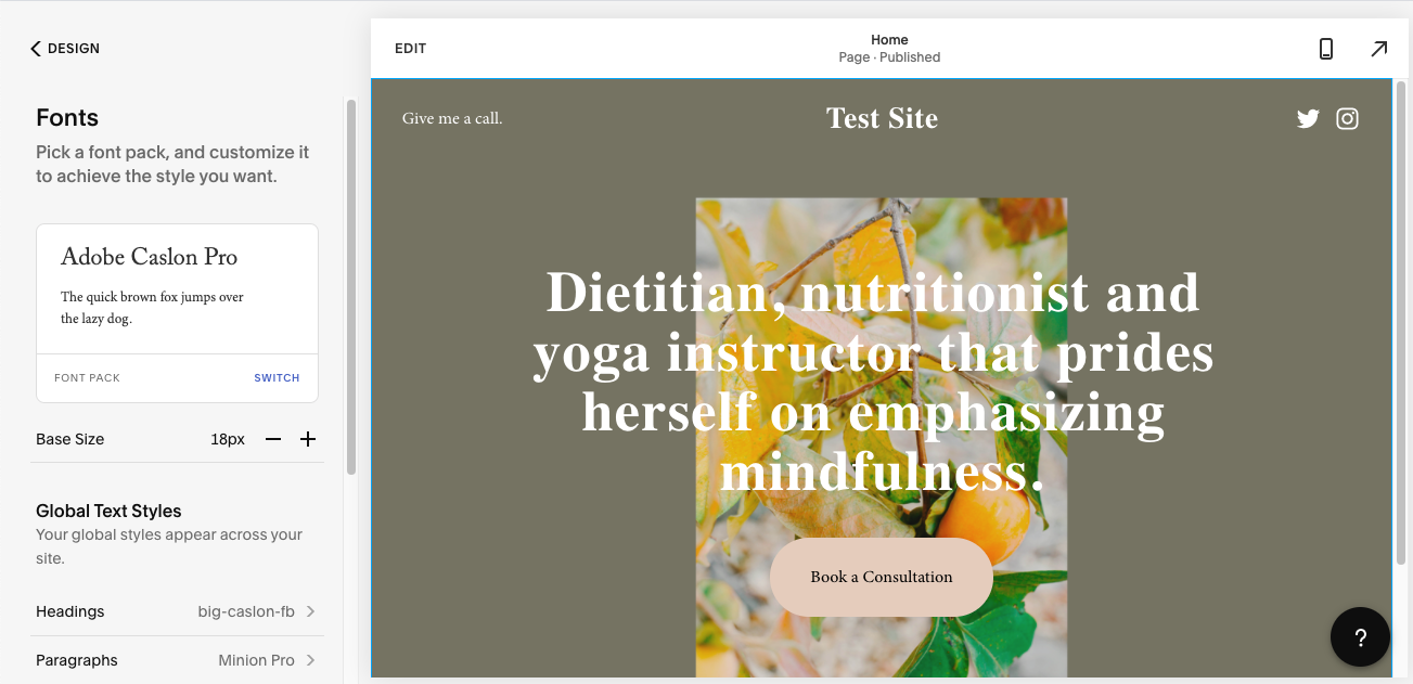
The only way to create a custom website is to have a designer or developer essentially “break” the code. And if that’s the route you want to go, you’re better off using a different website platform.
Showit website design
With Showit, you can build your website any way you want.
For instance, Showit has tons of free and premium templates you can use to design your website:
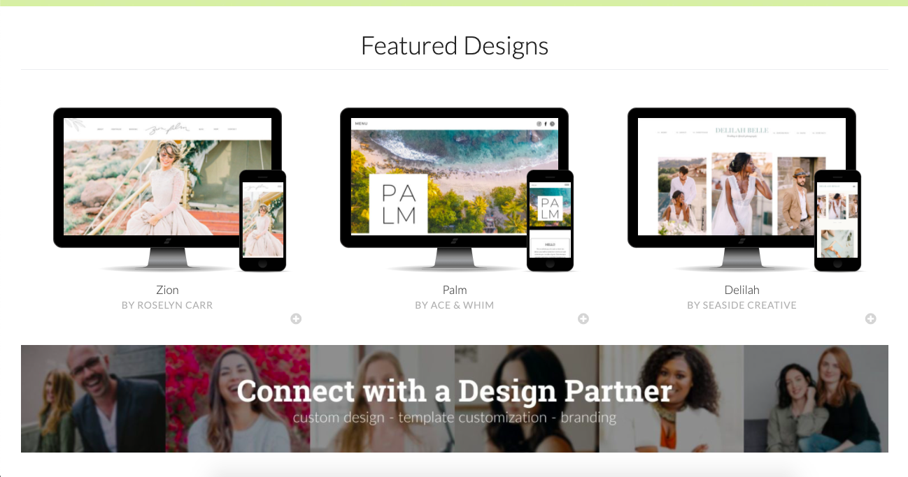
And if you find a Showit template you like from outside of the Showit store, you can use one of those instead.
What’s more, you can start with a template and then fully customize it to your liking. Or you can simply build your website from the ground up with a completely custom design.
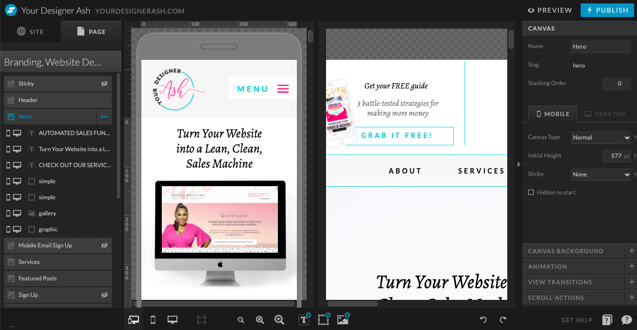
As you can see below, the Showit website builder gives you control over everything. (And yes, this is how I built and currently manage my actual website.)
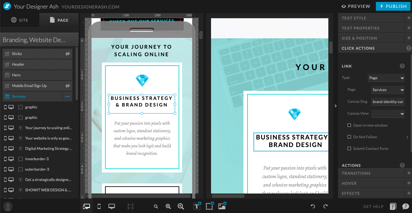
Not only do you get to determine what goes on your website, but you get to decide:
- Where it goes
- How it looks
- How the content is positioned
- How it behaves when someone interacts with it
- And so much more
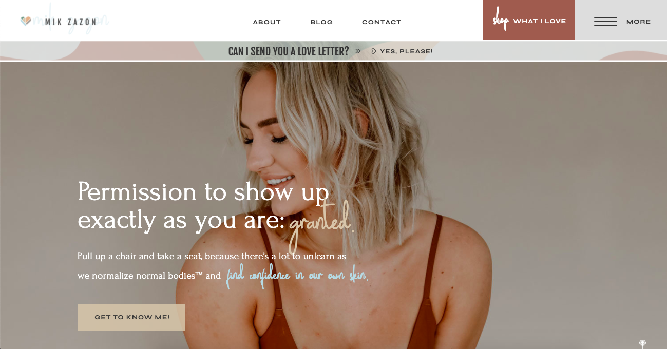
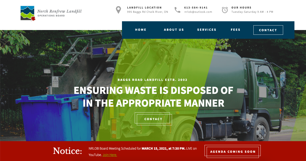
To show you how much flexibility (and creativity) you have with Showit, take a look at some websites I recently designed with it:
Making your website look good on mobile
Did you know that Google will give a website a boost in rankings if it’s properly set up for its mobile visitors?
While responsive design helps with that (where a website automatically shifts and resizes based on the screen it’s viewed on), it’s not a perfect solution.
Let’s take a look at what Showit and Squarespace are doing about it:
Squarespace and responsive design
Squarespace’s website templates are responsive by nature. You can use the desktop/mobile switcher in the top-right corner of the editor to see how easily the website fits to each screen.
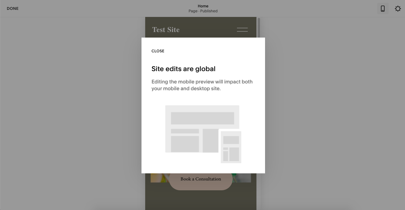
What you can’t do, however, is edit your mobile site separately from the desktop:
Does this even matter?
It might. It all depends on how happy you are with how your content and design flow into a smartphone- or tablet-sized screen. In some cases, the spaces that exist on the regular (desktop) website might appear too large on mobile. Or blocks may appear out of order.
Squarespace doesn’t give you the ability to customize the mobile experience, so you’ll just have to trust your responsive template to handle it for you.
Showit and responsive design
Showit also allows you to create mobile responsive websites. However, it takes it another step further.
One thing you can do with Showit is to design a piece of the website differently depending on which device the visitor accesses it on. Being able to make slight tweaks to the mobile site’s design and content can make a huge difference in your visitors’ experience.
There’s another thing you can do with Showit that’s different:
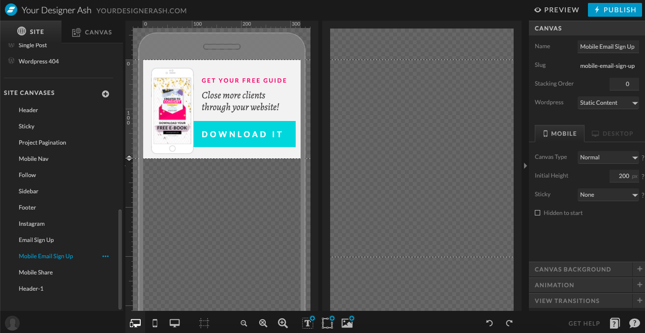
You can design entirely different elements, show different messages, or organize your site differently using Site Canvases.
Why would you want to do that?
Well, let’s say you run a fitness center. Your customers might be more likely to use the mobile site to log into their account and manage their membership, check into a class, etc. So, designing the Login button to be bigger and appear closer to the top of the mobile site would make it a much easier and convenient action to take.
These are the kinds of things Showit allows us to consider when designing websites for our visitors.
Blogging with Showit vs. Squarespace
Content marketing is something every business owner needs to be doing — to get the word out, to become a trustworthy source of information, and to give your business extra credibility with prospects and customers alike.
Let’s see how these two platforms stack up when it comes to blogging:
Creating a Squarespace blog
Your Squarespace template doesn’t automatically come with a blog, so this is something we have to set up. That process is easy enough:
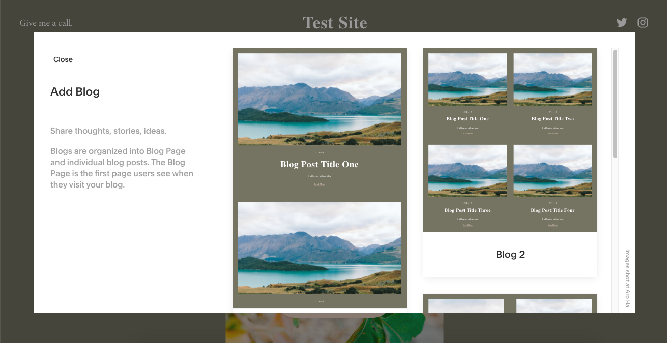
Squarespace gives you a few options for blog layouts. You pick the one you like and there you have it! Your blog is set up and ready to go with premade blog post templates.
As with the rest of the site, you won’t have complete control over how the design of your blog pages shape up. However, you do have a lot of flexibility in terms of what you write about and how you present it to blog readers:
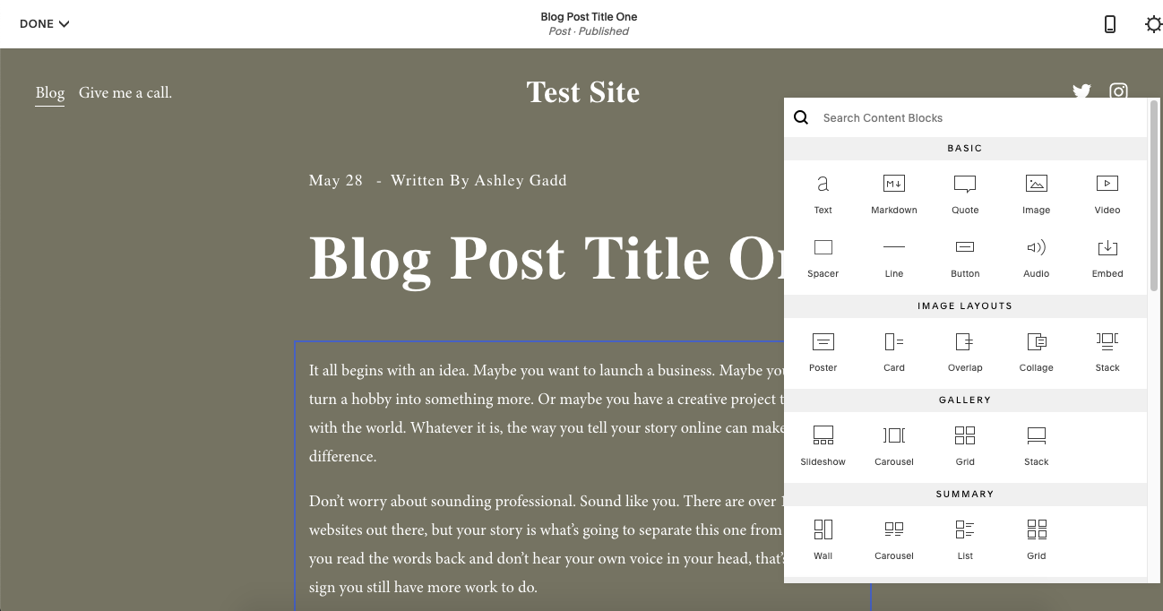
Something to think about is how Squarespace handles SEO though:
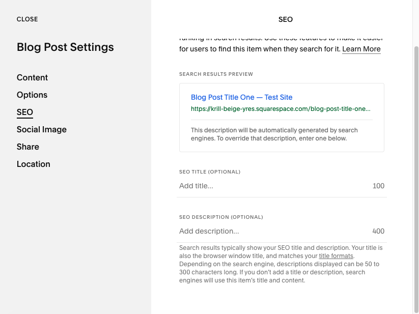
You’ll have control over two search metadata fields: the page title and description. These are the ones that show up when someone finds your website in Google search results.
This is useful… but there’s so much more you could be doing to help your blog posts rank.
Creating a Showit blog
Look up at your address bar and you’ll see that my blog lives at https://blog.yourdesignerash.com/. It looks and works just like the rest of my website, right?
Here’s the thing though:
My blog is hosted on WordPress instead of Showit:
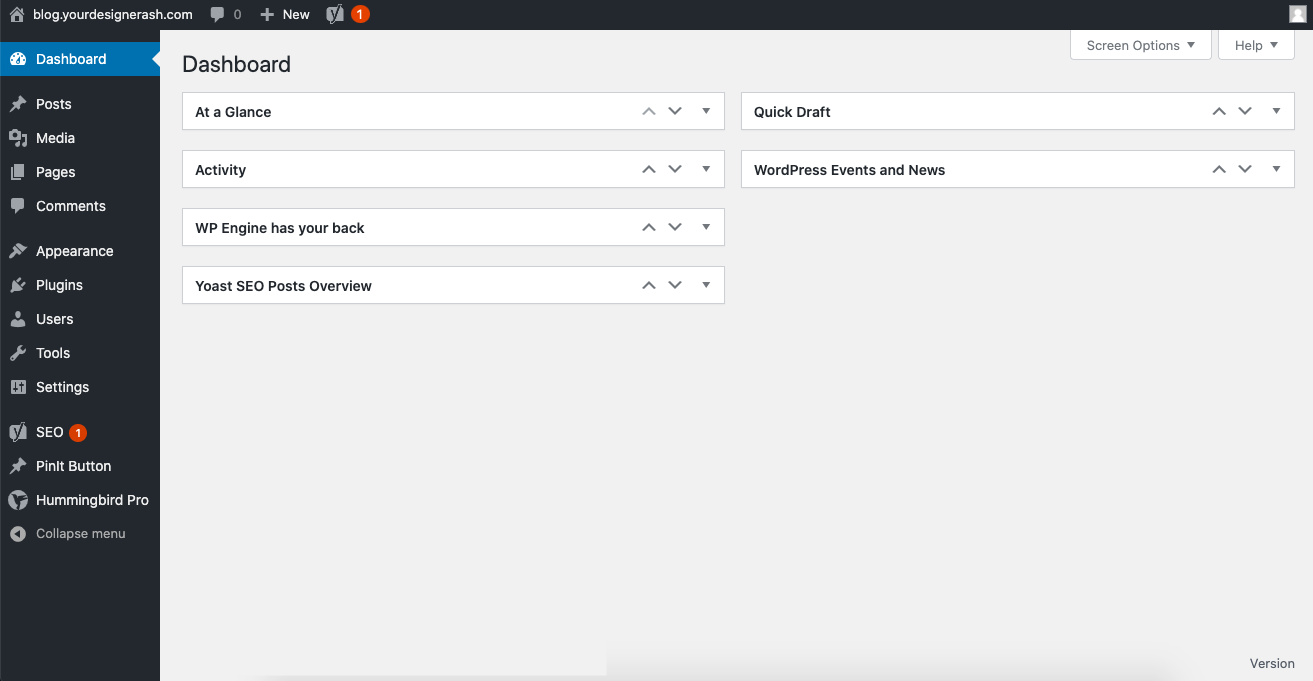
Why would I do this? Well, Showit plays to its strengths and lets others master its weaknesses. Like blogging.
WordPress was originally built for blogging. There are very few website platforms that can match a WordPress-built blog as a result:
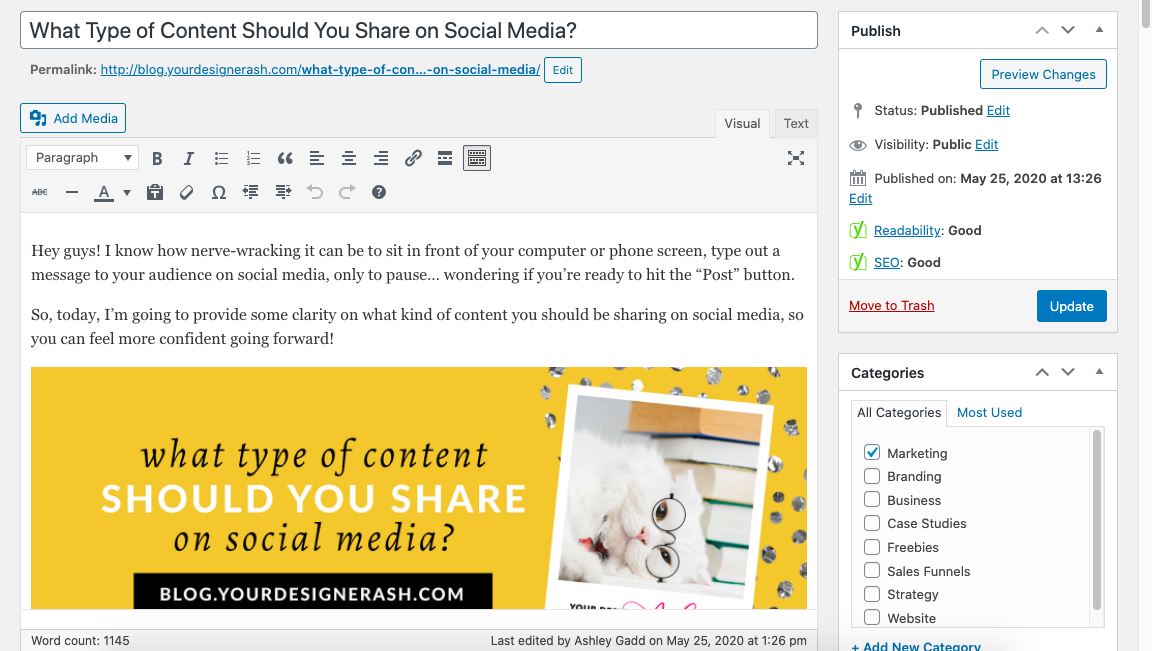
So, rather than Showit spend time building out a blogging feature, it works directly with WordPress so its users can get the best of both worlds.
And one of the best parts about creating your Showit blog on WordPress is that you get to use the Yoast SEO plugin:
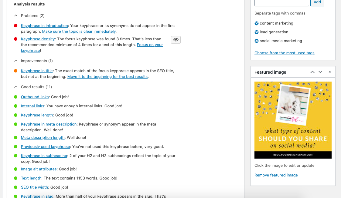
With Yoast, you can customize each page’s:
- Keyword
- URL
- Meta title
- Meta description
Plus, Yoast will take all that information and tell you how to improve it as well as the readability of your content as a whole. It’s a serious game-changer for SEO.
Selling products and services
For some of you, ecommerce isn’t going to matter. In which case, you can skip down to the next section.
However, for anyone who wants to sell anything online — be it products, services, memberships, your latest book, and so on — the way in which your website platform supports this will matter a great deal.
eCommerce with Squarespace
Squarespace comes with its own ecommerce solution. This is a great option if you plan to build an online store that’s chock full of physical or digital products.
Squarespace takes you through everything you need to do to get your store online:
- Choose a layout (design) for it.
- Add products.
- Set up a system to collect payments.
- Choose your product shipment options.
- And so on.
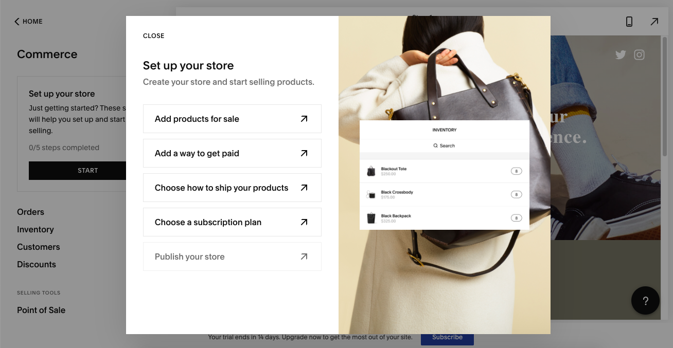
Just keep in mind that, again, you don’t have a ton of control when it comes to the design.
In fact, Squarespace won’t ask you to choose a template for your store. Instead, you’ll choose different layouts for the store’s homepage as well as its product pages.
If that’s not a big deal to you, good. Because Squarespace makes it very easy to build and manage an online store:
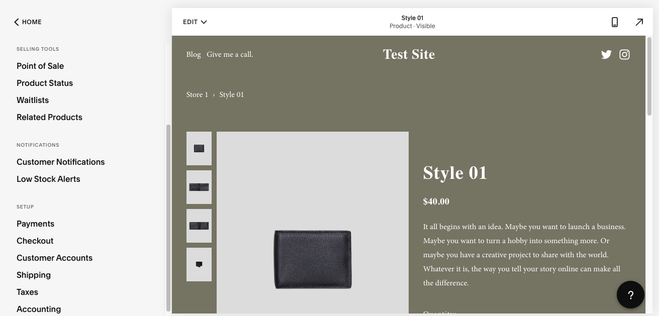
You can control things like inventory limits, related product recommendations, taxes, and more.
eCommerce with Showit
Similar to blogging, Showit doesn’t come with built-in selling tools.
Remember: Showit is a really strong platform when it comes to building custom, feature-rich websites. It makes sense that it would leave something like ecommerce to platforms like WooCommerce (through WordPress) or Shopify.
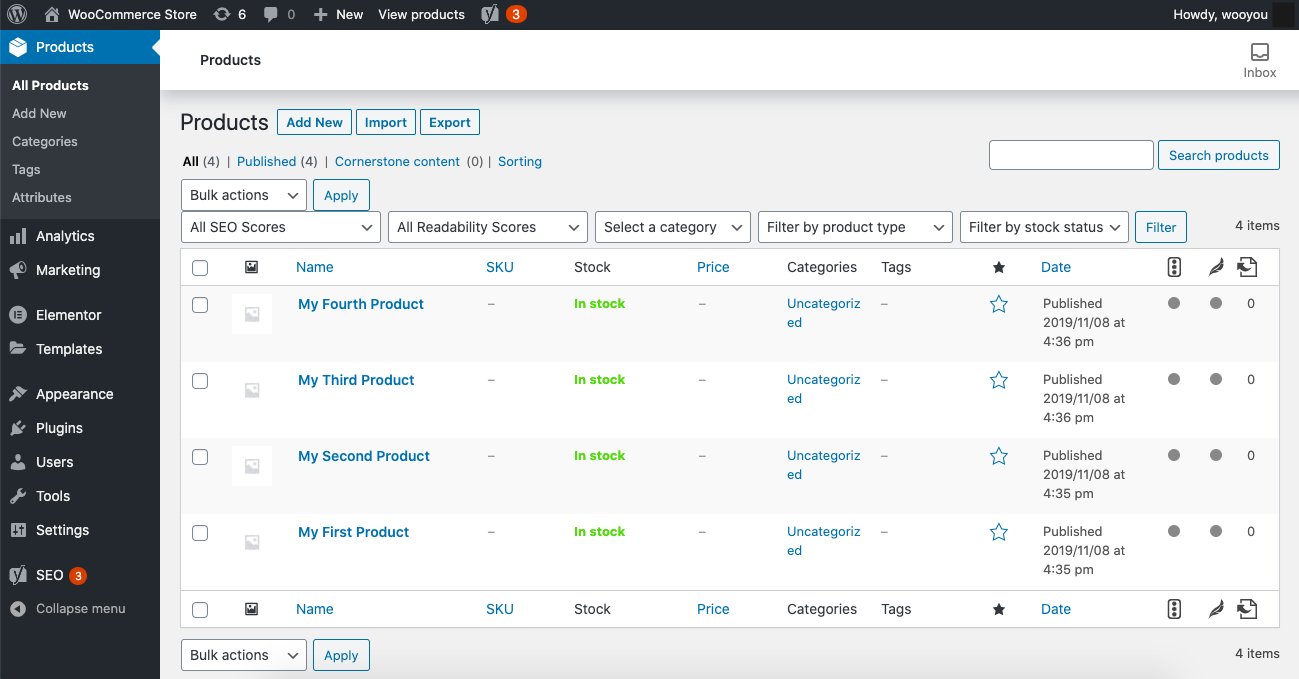
And don’t worry. These platforms sync just as seamlessly with your Showit site as a WordPress blog does.
Oh, one more thing to mention. As a bonus for using WooCommerce, you’ll have the advantage of using Yoast SEO to optimize your product categories and pages for search results!
What to expect from customer support
Last but not least, it’s important that we talk about customer support. This is where many website platforms seriously fail their users — and that’s a big problem, especially when something fails on your website and you don’t know what to do.
Both Squarespace and Showit, however, do this extremely well.
Squarespace support
Squarespace’s support is built right into its website platform. So, if you run into problems while editing your website or you have a question that you want to look into, look no further than the dashboard:
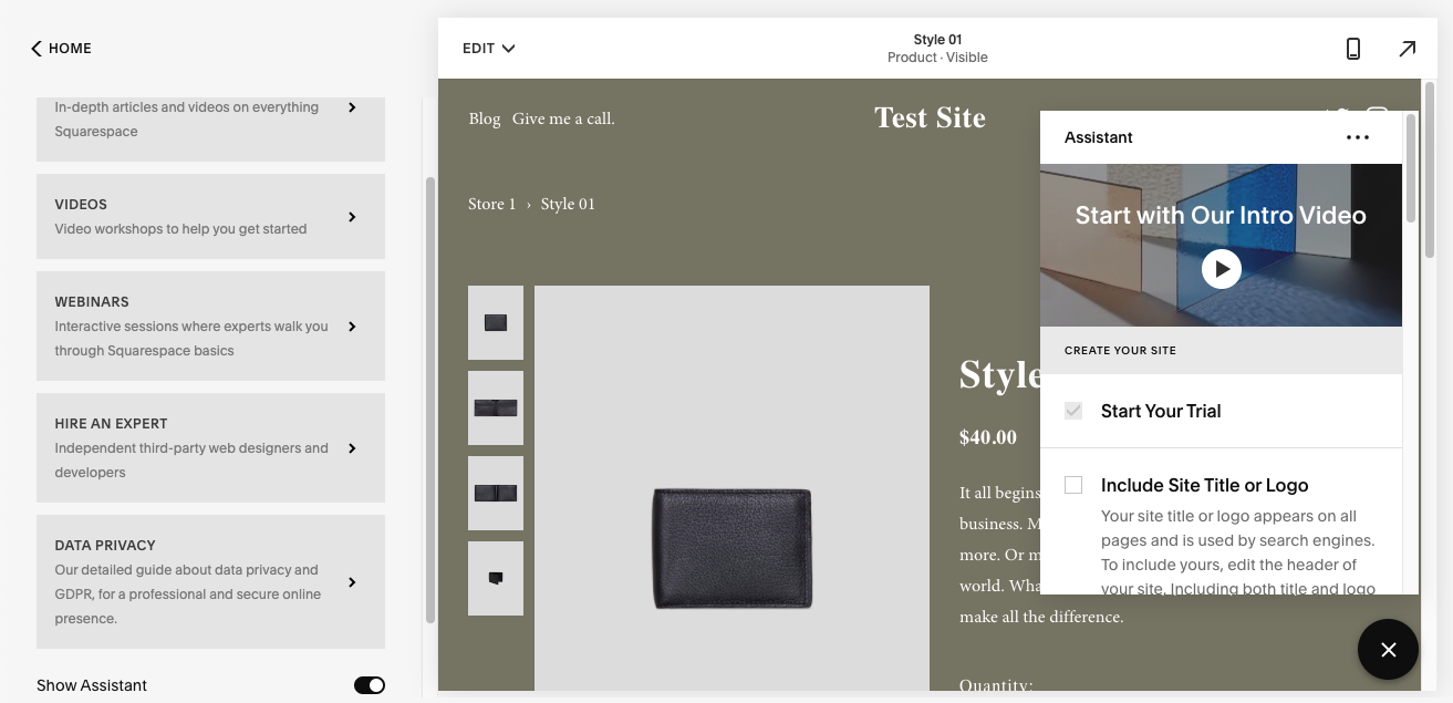
There are so many self-help resources available. And, if you can’t sort it out on your own, the assistant lives in the bottom-right corner of your editor at all times.
Showit support
Showit also provides access to customer support on your dashboard. If you want to go the self-help route, you’ll be directed to the support section of the Showit website:
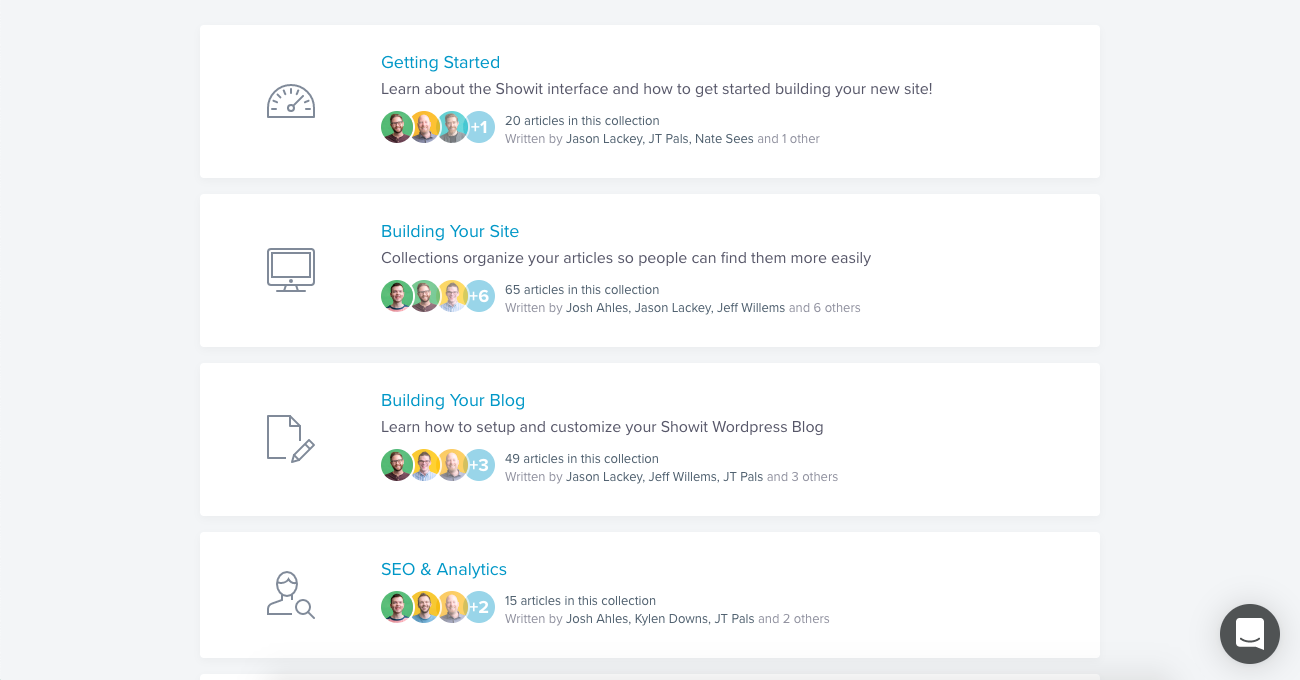
If you’d rather talk to someone if you have a more urgent or perplexing matter, you can do so using the live chat option in the editor:
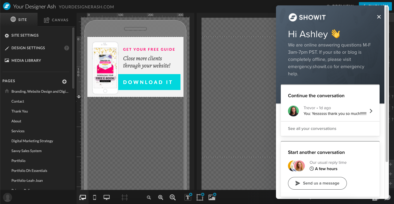
You can see that me and my team have had no problem using this before! Thank goodness it saves our chat histories, too, so we can look back to see what we did previously to resolve issues we encountered.
Showit vs. Squarespace: Which Website Platform Will Serve You Best?
Your website platform should empower your business to grow, not hinder its progress every step of the way.
If you’re still not sure whether Showit or Squarespace is the one to lift your business up, that’s okay. I’m happy to discuss the options with you!
Simply book a call with me and we can determine what the best path is for your custom website project.
Psst...before you go! Get our FREE e-book:
how to attract, delight and close more clients
PLUS GET DESIGN TIPS, ADVICE & FREEBIES DELIVERED TO YOUR INBOX
DOWNLOAD THE EBOOK
Ashley Gadd
Written By:
Ashley Gadd is an award-winning business brand strategist, website designer, and educator who helps clients turn their ideas into captivating and strategic brands that convert. Blending her background in nonprofit marketing with her education in design, Ashley offers customer-centric brand experiences that connect the visual and strategic dots providing her clients the tools to build a sustainable and profitable business they’re proud of.
Brand Strategist - Website Designer - Educator
Leave a Reply Cancel reply
Anything is possible. Explore more.
CONTENT MARKETING
Case Studies
BUSINESS STRATEGY
WEBSITE
BRANDING
Sales Funnels
Let's be Friends!
Connecting the design and marketing dots to create a visual story that captures your shine and shares your message and mission in style.
Use this worksheet to bring more clarity to your business! Let this be your first step before you tackle your ideal customer profile and buyer persona.
FIND YOUR NICHE WORKSHEET!
DOWNLOAD THE WORKSHEET
Stick Around!
and bring much-needed clarity to your business.
[…] to be more theme-based. Instead, look for a designer who uses tools like Illustrator, Photoshop and Showit (just to name a […]